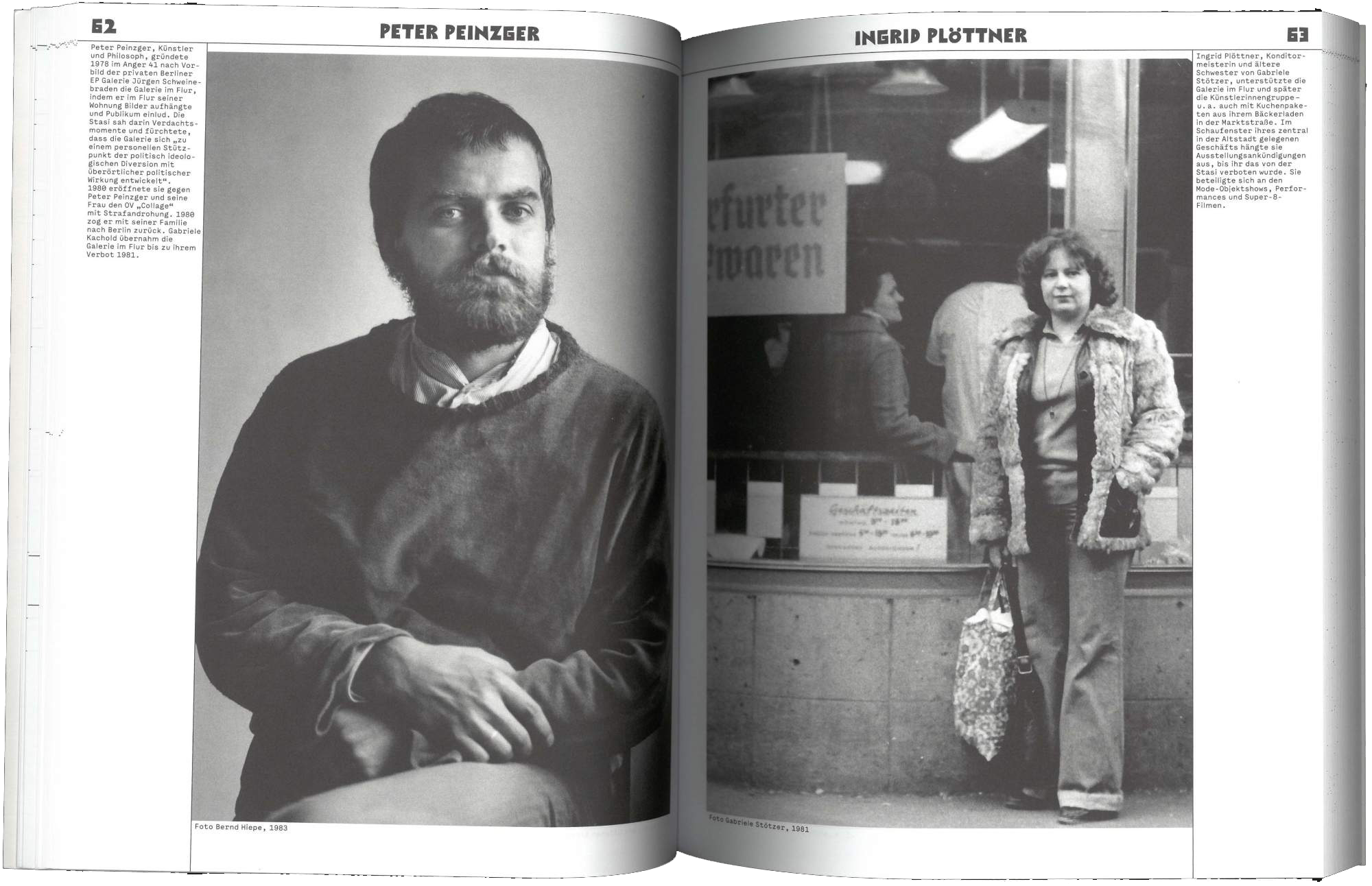
Rike (Semi) Mono was designed for a publication about artists in the GDR. The design is based on several letters typed on the backs of photographs documenting the student protests in Berlin in the late 1960s. The typeface used in these photographs is likely ›Bullit‹, created by the Italian typewriter manufacturer Olivetti.
Rike Mono references this origin in some of its letters and overall character, yet has developed its own formal language. It offers bold, classic typewriter-style letters in a contemporary design, complemented by lighter cuts and Old Style and Semi-Mono style sets.
Rike Mono is available upon request via email.